- Published on
Simple Linear Regression: Mathematical Intuition and Implementation in Python
- Authors

- Name
- Anurag Verma
- @anurag_629
Introduction
In this article, we will learn about the mathematical intuition behind simple linear regression and implement it in Python through a simple and easy-to-understand example with storytelling.
Simple storytelling example
Consider you are a foodie who loves doughnuts and every weekend, you find yourself in 'Doughnutville', a magical town where the size of a doughnut corresponds to the amount of happiness it brings. To understand this incredible phenomena, you start an experiment.
You decide to take two factors into account - the diameter of the doughnut (independent variable, X), and the level of happiness you experience (dependent variable, y). Let's just assume for a moment that your happiness can be quantified on a scale of 1 to 100.
In mathamatical terms, the independent variable is the variable that is changed or controlled in a scientific experiment to test the effects on the dependent variable. A dependent variable is the variable being tested and measured in a scientific experiment.
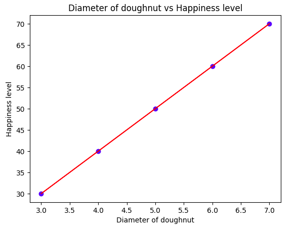
As the weekend progresses, you start noting down these observations. The 'Delightful Doughnut', with a small diameter of 3 inches, gives you a happiness scale of 30. The 'Jumbo Joy', with a whopping 7 inches, takes you to cloud nine with a happiness level of 70.
Now, you're a bit of a mathematician at heart, and continually seeing these numbers, you begin to notice a pattern. You realize that whatever the diameter, your happiness scale seems to be approximately 10 times that.
In mathematical terms, your hypothesis looks something like this: y (happiness) = 10x (diameter) + j, where 'j' is the base happiness you have just being in Doughnutville, even without eating a doughnut.
y- Happiness level: Dependent variablex- Diameter of doughnut: Independent variablej- Base happiness level
This, my friend, is your own custom version of simple linear regression! It's as if there's an invisible line passing through the doughnut-infused haze of Doughnutville, establishing a relationship between the doughnuts' size and your happiness level.
Do remember, in the much less enjoyable real world, other factors might affect your happiness and the relationship may not be as simple -- giving rise to more complex variations of regression. But for a simple, light-hearted journey into the world of Machine Learning and predictive analysis, this should provide a starting point.
Now presume that next weekend you visit Doughnutville and see a doughnut with a diameter of 5 inches. Can't you already predict your happiness level based on previous data? That's right, around the happiness level of 50, as per the equation. This is the essence of simple linear regression: predicting based on past data.
Welcome to the sweet and frosted world of simple linear regression!
Simple Linear Regression
In simple linear regression, we try to establish a relationship between two variables, X and y, where X is the independent variable and y is the dependent variable. The relationship is represented by the equation:
y- Dependent variablex- Independent variableβ0- Interceptβ1- Slope
The equation above is the equation of a straight line, where β0 is the intercept and β1 is the slope.
Let's understand the equation and build some intuition with below example dataset
| Diameter of doughnut (inches) | Happiness level (1-100) |
|---|---|
| 3 | 30 |
| 4 | 40 |
| 5 | 50 |
| 6 | 60 |
| 7 | 70 |
Now, let's see it in terms of mathamatical equations and formulas and try to understand the intuition behind it.
X = [3, 4, 5, 6, 7]
y = [30, 40, 50, 60, 70]
Step 1: Calculate the mean of X and y
import math
mean_x = sum(X) / len(X)
mean_y = sum(y) / len(y)
Step 2: Calculate the total number of values
n = len(X)
Step 3: Calculate the slope β1
numer = 0
denom = 0
for i in range(n):
    numer += (X[i] - mean_x) * (y[i] - mean_y)
    denom += (X[i] - mean_x) ** 2
beta1 = numer / denom
Step 4: Calculate the intercept β0
beta0 = mean_y - (beta1 * mean_x)
Step 5: Predict y for any given value of X
y_pred = []
for i in range(n):
    y_pred.append(beta0 + (beta1 * X[i]))

print(y_pred)
Step 6: Plot the graph
plt.scatter(X, y, color = 'blue')
plt.plot(X, y_pred, color = 'red')
plt.title('Diameter of doughnut vs Happiness level')
plt.xlabel('Diameter of doughnut')
plt.ylabel('Happiness level')
plt.show()

Now, you must have a question in your mind that we have completed above steps but why we calculated these things like
mean,slope,interceptetc.?
Let's understand why we calculated these things.
The goal of simple linear regression is to find the line that best fits the data. We want to find the values of β0 and β1 that minimize the distance between our line and the actual data points.
Calculating the mean X (⍺x) and mean y (⍺y) helps center the data. It provides a reference point for calculating the line's intercept.
The slope β1 tells us the relationship between X and y. It measures how much y changes for a 1 unit change in X. We calculate it by finding the correlation between (x - ⍺x) and (y - ⍺y). This covariance formula removes the means and captures the relationship.
The intercept β0 is where the line crosses the y-axis. We calculate it using the means and slope to position the line properly on the graph.
By finding the slope and intercept that best fit the data, we can predict y for any new X value. The line models the relationship we observe in the data.
So in summary:
- Mean centers the data
- Slope models the relationship between X and y
- Intercept positions the line on the graph
- Together they create a line that best fits the data
Calculating these parameters gives us a linear model that captures the trend in the data. We can use it to predict new y's for given X's. The intuition is we are finding the line that minimizes the deviation from the true data points.
Implementing Simple Linear Regression in Python
Now that we have a basic understanding of simple linear regression, let's implement it in Python. We will use the scikit-learn library to implement simple linear regression.
We will use same doughnut example to implement simple linear regression in Python.
Use dataset from Kaggle to follow along. You can also use notebook from Kaggle to run the code by yourself.
Dataset contains two files - train.csv and test.csv. We will use train.csv file to train our model and test.csv file to test our model.
Importing libraries
import numpy as np
import pandas as pd
import matplotlib.pyplot as plt
from sklearn.linear_model import LinearRegression
Loading dataset
train = pd.read_csv('/kaggle/working/train_data.csv')
test = pd.read_csv('/kaggle/working/test_data.csv')
Exploratory Data Analysis
train.head()
test.head()
train.shape
test.shape
train.info()
test.info()
train.describe()
test.describe()
Data Visualization
plt.scatter(train['x'], train['y'], color = 'blue')
plt.xlabel('Diameter of doughnut')
plt.ylabel('Happiness level')
plt.title('Diameter of doughnut vs Happiness level')
Splitting dataset into X and y
X_train = train.iloc[:, :-1].values
y_train = train.iloc[:, -1].values
X_test = test.iloc[:, :-1].values
y_test = test.iloc[:, -1].values
Training the model
regressor = LinearRegression()
regressor.fit(X_train, y_train)
Predicting the test set results
y_pred = regressor.predict(X_test)
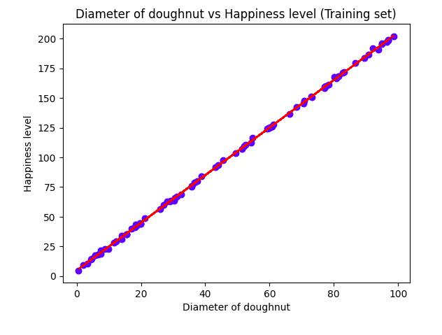
Visualizing the training set results
plt.scatter(X_train, y_train, color = 'blue')
plt.plot(X_train, regressor.predict(X_train), color = 'red')
plt.title('Diameter of doughnut vs Happiness level (Training set)')
plt.xlabel('Diameter of doughnut')
plt.ylabel('Happiness level')
plt.show()

Visualizing the test set results
plt.scatter(X_test, y_test, color = 'blue')
plt.plot(X_train, regressor.predict(X_train), color = 'red')
plt.title('Diameter of doughnut vs Happiness level (Test set)')
plt.xlabel('Diameter of doughnut')
plt.ylabel('Happiness level')
plt.show()

Evaluating the model performance
from sklearn.metrics import r2_score
r2_score(y_test, y_pred)
Conclusion
In this article, we learned about the mathematical intuition behind simple linear regression and implemented it in Python through a simple and easy-to-understand example with storytelling.
Hope you enjoyed reading this article. If you have any questions or feedback, please feel free to reach out to me on Twitter or LinkedIn and follow me for more interesting articles on Machine Learning, Deep Learning, and Data Science.